Climate Change Since 1950
May 10, 2014
Following up on my previous post on world temperatures, I’ve decided to do some more historical analysis of the GHCN data set.
Standard Disclaimer
Climate change can be a bit of a controversial topic, and so it’s relevant for me to start by saying that I have no credentials to speak of in this field beyond an interest in science. :) It’s also important to note that the dataset I’m using, the monthly summaries of the Global Historical Climatology Network (GHCN), was normalized and modified by NOAA before I even started looking at it. That said, in this graphic I’ve done my best to simply present the data as I received it without bias.
A Few Statistical Results
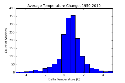
I defined stations suitable for inclusion as those with at least one full year of data between 1950 and 1954, and at least a full year of data between 2008 and 2013 (most included stations had 4 or 5 years of available data in both periods). Of the 1686 stations that fit these criteria, 1222, or 72%, are located in the USA.
The mean increase was 0.58°C, and the median was 0.66°C. A histogram of the temperature change at each station shows a fairly normal distribution, centered between 0.5 and 1 degree.

Visualization
A map of temperature changes by station is below. Clicking on a marker pulls up a 60-year trend line for that station. As you browse, you’ll find that the data is at times sparse (years or entire decades missing) or noisy (the mean temperature doesn’t always stay between the min and max). These are reflections of the underlying dataset, not a result of my processing. :)
[(fullscreen)](http://corbt.s3-website-us-east-1.amazonaws.com/weather/historical_map/map.html)Code
I’ve written up my work in an ipython notebook here. In addition to documenting this project, I’ve also tried to format it as an introduction to data analysis in python. If that interests you, feel free to take a look.