As a primer in graph analysis and clustering, I decided to map the relationships between countries in the Twitterverse.
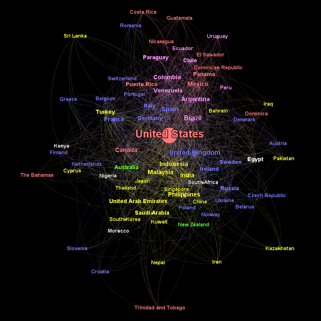
Here’s the final product. Read on for how it was generated.

Getting the Data
Twitter’s API is well documented and quite powerful. I used the tweepy Python client to consume it.
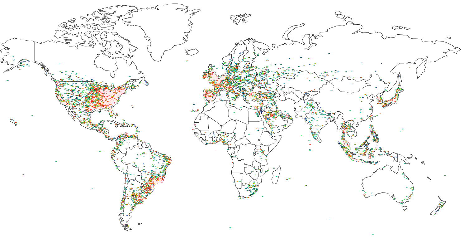
The first step was procuring a representative sample of Twitter users. By connecting to the sample streaming API I was able to pull about 100,000 individual tweets in 24 hours, even when filtering for only those with location data included. Collecting data for a full 24 hours at a minimum is important because different parts of the world are active at different times of day (apparently even avid Twitter users need to sleep! :).
Heatmap of Collected Tweets

###Data Processing Once I had my truckload of data, I had to pare it down. Mapping followers requires actually getting followers first, and at the 1 request/minute Twitter API rate limit pulling followers for my whole 100,000 user sample would have taken 69.4 days, which didn’t sound like my favorite plan. Instead I wrote a script to randomly sample 5000 users from the set to make the process more manageable. I then was able to pull the followers for those 5000 users in about 4 days, a slightly more reasonable timeframe.
The final processing step was associating each user with a country. Tweets can be associated with exact location data, but unfortunately Twitter users are not. However, there is a freeform text field called “Location” that each user can fill out if they choose. It’s an inexact science, but I used the Bing Maps reverse-geocoding API to make a best-guess at the country that each location corresponded to. Not all of the data was accurate – I have a hard time believing that user @Barlynda_GG really lives in “61 ♥” (is that even a legal name?) – but on the whole the process seemed fairly accurate.
Generating the Graph
I owe the inspiration for most of the next section to Gilad Lotan’s excellent talk Mapping Twitter’s Python and Data Science Communities. I chose to model the Twitterverse as an undirected graph. Each user who followed another user outside of his own country added an edge between the two nations. If such a link already existed its weight is increased by one. This way the countries with the greatest number of bidirectional followers (such as the US and UK) have a very weighty edge connecting them, causing them to be grouped closely in the final graph.
Actual analysis of the graph was done in Gephi. Gephi is extremely powerful, but like other open-source data mining software (I’m looking at you, Weka!) the user interface… leaves a lot to be desired for a novice. However, by closely following along in the video at the end of the blog post above I was able to find where most of the functions I needed were located. I rescaled the nodes by the number of followed users they had and set the colors by continent (red for North America, pink for South America, blue for Europe, yellow for Asia and green for Oceana/Australia). I also eliminated nodes with fewer than 9 connections to other countries. This was unfortunately necessary because of my small sample size of only ~20,000 following relationships.
Finally, I experimented with different clustering algorithms to try and bring some order to the graph. I began with OpenOrd, which apparently works well for larger graphs but got completely flummoxed on one with only about 80 nodes. After trying a few more I found good results with Force Atlas 2 (selecting the LinLog and Prevent Overlap modes) that induced some reasonable clusters in the graph.

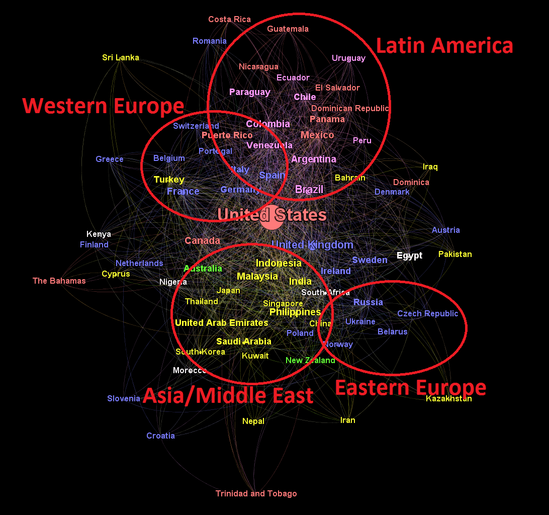
Some definite communities are apparent in the final product. Latin America was the first one that jumped out to me. All the Spanish-speaking American countries, as well as Spain, are grouped at the top of the frame. In fact, the only American-continent nations to escape the cluster are The Bahamas, Trinidad and Tobago, Dominica, the United States and Canada, all of which speak English.
Another strongly connected subcomponent is the yellow Asian/Middle Eastern cluster below the center. This is less easily explained than the common culture and language uniting the Latin American countries. It may be the result of emigrants from Southeast Asia to the other countries in the group connecting with their friends and figures back home (this is also my hypothesis for the close affinity of Turkey to the nations of Western Europe). Of course, it could also be something else entirely.
Europe was the biggest surprise for me. Although there are minor clusters comprising Eastern and Western Europe on the right and left sides of the graph respectively, the continent as a whole does not seem closely connected, at least not on Twitter!
Summary Statistics
####Percentage of Following Relationships that are International 39% ####Strongest Directed Connections
- United States->United Kingdom
- United Kingdom->United States
- Brazil->United States
- United States->Indonesia
- Indonesia->United States
####Most Represented Countries
- United States
- Indonesia
- Brazil
- United Kingdom
- Turkey
All code used in this project is open source and available on Github. Happy mining.
