
For a class project in machine learning I had to procure some data and mine it. I decided to work with predicting road traffic levels.
The actual machine learning involved was fairly straightforward, and you can get an idea of the process I went through on the project Github. The data was sampled from the Bing Maps traffic API at the coordinates (37.72362, -122.40134) (Bayshore Freeway in San Francisco)
The most interesting deliverable was a couple of visualizations I came up with as a byproduct of the actual machine learning. The first was a simple chart comparing hour of the day (0-24) to average traffic level over the two weeks I collected data for.
Traffic level vs Hour of the Day
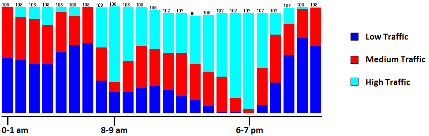
This matches intuition – traffic is worse at night than in the morning, and peaks at the morning and evening rush hour.
The second image is a correlation between the current traffic level and that of the previous hour.
Traffic level Correlation Over Time
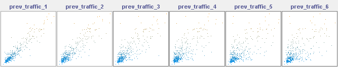
This gives a good feel for how quickly the level of traffic changes over time. Each successive scatterplot shows the relationship between current and past traffic in 10 minute increments. The last graph, for example, shows the correlation between current traffic and traffic an hour ago.
With a neural net trained with time of day, day of the week, and current weather, the model was able to predict what future traffic would look like with about 71% accuracy, a number I’m happy with.